Being a visual learner, I often find it hard to digest some complex concepts without imagining in my head what it might look like. Studies have shown that 65 percent of us are visual learners, which means learning things visually is much faster and more effective than other ways. This also explains why we would fall asleep so quickly in a monologue lecture while staying far more alert just surfing our Instagram!
Then why don’t we try to bring more visual elements into how we learn Statistics, Math and Data Science? I really believe that we all can benefit from the new intuitions and perspectives it brings, which also stick easier and longer in our memory.
In this post, I want to share with you my collection of some useful sources that can help you precisely here.
*Update 2021: You can also watch the video version of this whole article below on my Youtube channel📹.
1. Explained Visually — A Setosa Project
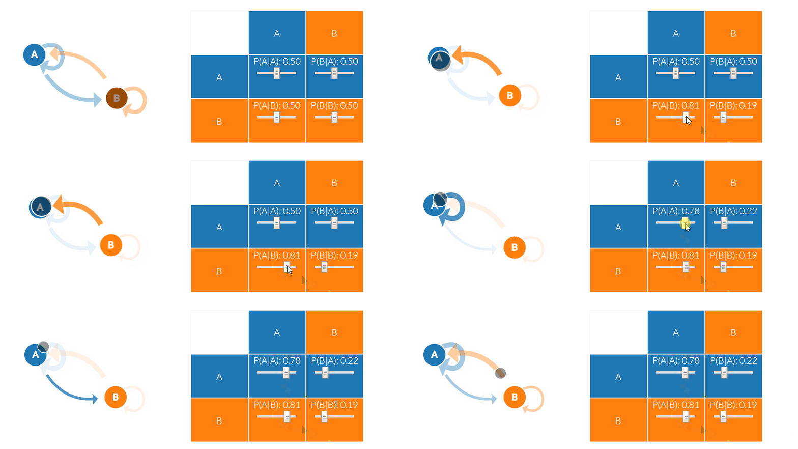
Explained Visually is a project aiming to make hard ideas intuitive. You can find here the visual explanations of a variety of mathematics and statistical concepts: from Ordinary Least Squares Regression to Eigenvectors, to Principal Component Analysis and Markov Chains. The best thing is, you can interact directly with the visualization, change parameters to inspect what’s happening. I was the one who never really understood Eigenvectors, until I looked at the explanation in this website!

2. Immersive Math
Immersive Math is an awesome interactive book about Linear Algebra. It’s said to be the world’s first linear algebra book with fully interactive figures. This book includes 10 chapters, explaining all the fundamentals of Linear Algebra (vectors, matrices, linear mappings, eigenvectors and eigenvalues, etc.). You can read the book online. Please note that you should read it on a browser rather than on your phone because some illustration may be rendered a bit slow.
3. 3Blue1Brown channel
3Blue1Brown is a Youtube channel created by Grant Sanderson (to be honest the channel name is so tongue-twisting and I can never really remember it). I think this channel is pretty well-known, with more than 2 million subscribers. You can find really useful videos and animations explaining a wide variety of Math and Stats topics. I found his channel while trying to find a way to explain DNN backprop algorithm to my colleagues. His videos on this topic are extremely helpful too.
4. Decision Tree Visually Explained
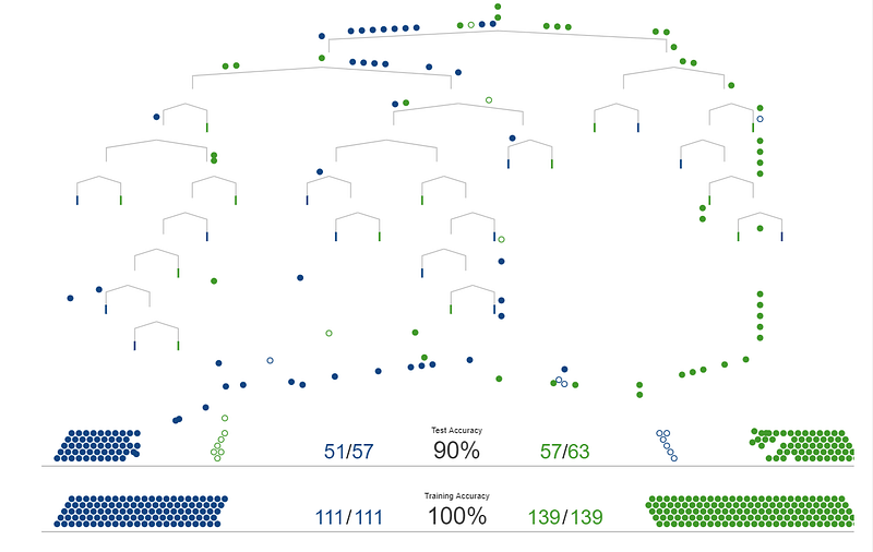
I came across this great d3 visualization explaining how decision trees work using scrollytelling. It is the first visualization I have ever seen attempting to use storytelling to teach machine learning. And it looks cool as hell! This website also has another post explaining model tuning and bias-variance tradeoff, which is another essential concept every aspiring data scientist should know.

5. How to use t-SNE effectively
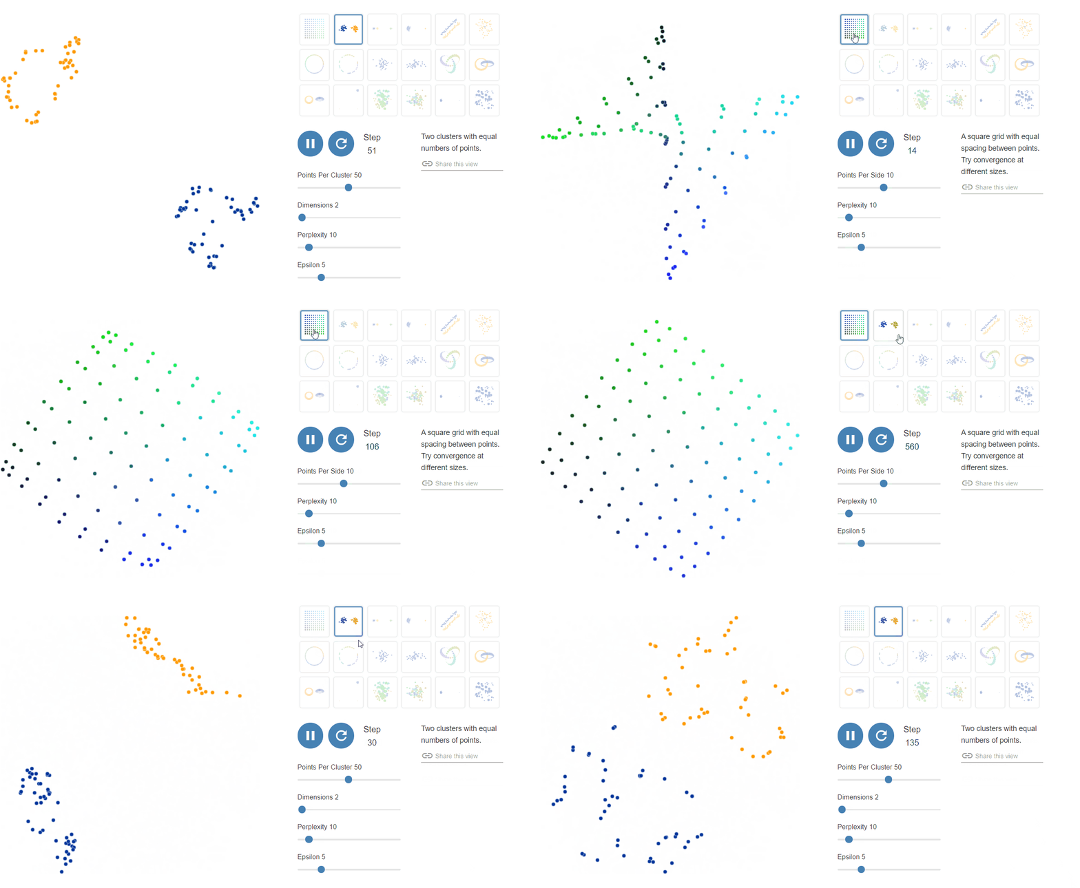
t-SNE (t-Distributed Stochastic Neighbor Embedding) is a non-linear technique for dimensionality reduction that is particularly well suited for the visualization of high-dimensional dataset, because it can reduce the data dimension to essentially 2 or 3 dimensions. This visual is one of the posts on the Distill website, which is another useful source for anyone who wants to learn deeper about the intuitions behind machine learning algorithms.
This visualization shows how effectively t-SNE algorithm works for different types of patterns in the data:

6. Visualizing Algorithms
Mike Bostock has a fun website for visualizing various computer science basic algorithms (sampling, shuffling, sorting, etc.). To me it’s very inspiring to look at these visuals. Even for things that you might take for granted, you still learn something new about them simply by taking a look from a different perspective.
7. Seeing Theory
Seeing Theory is another interactive visual introduction to probability and statistics, created by Daniel Kunin while an undergraduate at Brown University. It currently covers six chapters: basic probability, compound probability, probability distributions, frequentist interference, bayesian interference, and regression analysis. Each chapter contains interactive exercises to help visualize and understand the information.
Thank you for reading my post. I hope you found something new and useful. If you know similar sources, please comment and share! Enjoy learning :)

